

FIRST IMPRESSIONS IN MOTION
THE PROBLEM
My previous homepage was attractive, atmospheric and far too quiet for the work I wanted it to do.
After a long stretch of ignored applications, I took a harder look at the first impression my portfolio was making. Many of the roles I was pursuing called for dynamic, high-energy and distinctive visual thinking. Motion design was also appearing frequently, yet my homepage offered little immediate evidence of it.
The site explained my range, but visitors had to dig into the case studies to see it. My motion, live-action and game work was divided among separate reels on Vimeo, without a clear path from the homepage. I couldn’t assume that a busy hiring manager would go looking for it, or decide which reel to watch before understanding what connected the work.

THE REALIZATION
The homepage needed to become a demonstration, not simply an introduction.
A custom animation could establish energy and personality immediately while presenting four connected parts of my practice: art direction, motion design, interactive design and immersive worlds. It would show visual development, animation, pacing and systems thinking before a visitor clicked anything.
It could also provide a direct entrance to one consolidated reel, eliminating the need to leave the site and search through Vimeo. The hero would no longer just frame the portfolio. It would become portfolio work itself—a new piece designed, animated and evaluated in the exact context where it needed to function.

BUILDING A VISUAL LANGUAGE
From the beginning, I wanted the animation to feel like part of the website rather than a video or gallery piece placed on top of it. The visual language needed to be bold and immediately readable, with simple geometric forms that placed the emphasis on movement.
I developed style frames for four areas of my work. Each frame was designed with both its eventual behavior and its transition to the next scene in mind. A limited palette, shared geometry and recurring elements helped the four subjects feel like parts of one system rather than separate illustrations.
REMOVING THE FRAME
The first style frames used their own full-color backgrounds. They were energetic, but they still read as rectangular compositions sitting inside the webpage, the very gallery-like presentation I was trying to avoid.
The turning point was removing those separate fields of color and matching the animation’s background to the site itself. The page became the canvas. Forms could appear, transform and leave without the animation feeling contained inside a conventional video frame.
This also changed the compositions. Instead of relying on objects clipped by the edges, I began using more complete geometric forms with stronger silhouettes. Elements could still enter and exit through the boundaries, but the central compositions felt more intentional and more directly connected to the surrounding site.

.png)
TESTING IN CONTEXT
Before producing the complete sequence, I placed short motion tests directly into the website to evaluate playback, scaling, compression, file size, autoplay behavior and the platform’s built-in controls. Where the platform offered no direct control, I developed simple workarounds that preserved the intended presentation. The results confirmed the concept was technically viable and influenced how the animation was framed and delivered.
The video element’s default hover state introduced playback controls. Placing a transparent overlay above the video prevented the hover state from being triggered while preserving autoplay and leaving the separate PLAY REEL button fully functional.
DESIGNING FOR MOBILE
The original animation was designed desktop-first, and I did not give mobile enough consideration at the outset. On a phone, fitting the entire wide composition made the titles and action too small to be effective, while cropping it removed important parts of the sequence. The site platform also did not allow the desktop video to be replaced with a separate mobile version within the same element.
Rather than force the existing animation into a different shape, I rebuilt it as a compact square machine. A central circular stage contains the four disciplines while the surrounding controls, lines and mechanical elements create a consistent framework. Rotating the discipline titles vertically distinguished them from the horizontal name and job-title typography below, preventing the two layers of information from competing in the smaller space. A simplified palette without texture allowed the animation to be delivered as a lightweight mobile-only GIF.
The result is not simply a smaller version of the desktop animation, but a related design built specifically for its context. It also reinforced the value of testing responsive formats and platform limitations earlier in the process.

.png)
AI IN THE PROCESS
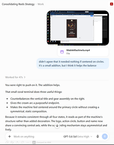
Throughout the project, I used ChatGPT as a conversational design and research tool. It helped me clarify the original problem, explore possible directions, test assumptions about hierarchy and pacing, and critique style frames and motion tests. It also accelerated research into delivery formats, playback behavior, compression and site-platform limitations.
The process was iterative rather than automated. No finished artwork or animation was generated by AI. I developed the concepts, created the visual assets and animation, and made the final decisions. I treated AI recommendations as possibilities; adopting some, modifying others and rejecting those that did not hold up in context. Its greatest value was providing a fast, persistent feedback loop that made assumptions and trade-offs easier to identify.
THE RESULTS, SO FAR
The animation is too new for me to claim that it has solved the larger problem that prompted it. What I can say is that the homepage now feels more representative of the work I want to do: active, visually distinctive and built around connected systems. It demonstrates motion immediately, provides a direct route to the reel and adapts the idea for mobile.
And if you have made it all the way to the final paragraph of the final case study, it has at least persuaded you to spend some time with the work. It's not a rigorous measurement, but it’s a promising start.