

OVERVIEW
Tara Shakti creates retro-inspired ski suits for women, rooted in a philosophy of empowerment, confidence, and community. The name draws from Tara, a revered female Buddha in Tibetan Buddhism associated with compassion, wisdom, and feminine strength, and Shakti, meaning power or energy. Together, they express the idea of “starpower,” the radiant strength within each person.
The founder wanted a mascot that could embody that spirit: bold, confident, unmistakably female, and infused with the same 1970s energy as the suits themselves. She envisioned a zebra as that character, a choice that also aligned naturally with the company’s identity as a “zebra company,” a values-driven brand built for sustainability rather than hyper-growth.
ROLE & SCOPE
I developed the mascot concept for Tara Shakti, creating a character system that worked within the brand’s existing visual identity and language while giving it a more flexible and expressive vehicle for expansion across apparel, storytelling, and promotional media.
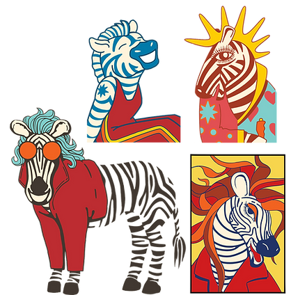
FINDING THE CHARACTER
Using exploration to define tone, personality, and range
I began with a wide-ranging concept exploration, developing multiple character directions to help define the mascot’s tone, personality, and visual boundaries. This early “shotgun” approach gave the client a clear way to respond emotionally to the work, allowing the character to take shape through dialogue rather than assumption.
FROM MASCOT TO SYSTEM
Building a character that could scale with the brand
Once a direction was chosen, the mascot evolved from a single illustration into a flexible brand system. It was designed to scale across apparel, print, social, and physical products while remaining visually coherent and emotionally consistent.
For Tara Shakti, the mascot became more than a visual element. It became a symbol of empowerment and belonging, reflecting the brand’s belief that when people feel confident and seen, their “starpower” shines.


Sticker designs created as event swag, extending the mascot system into small-format brand takeaways.
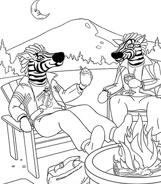
APPLIED ACROSS TOUCHPOINTS
As the character system developed, I extended it into social and motion pieces for events, seasonal moments, and brand promotions. These posts used short animated loops, bold color, and character-driven compositions to create lightweight campaign assets for mobile-first viewing.
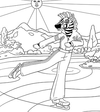

A custom coloring book placing the mascot in everyday contexts, broadening the brand narrative beyond downhill skiing.
OUTCOME
This project reinforced an approach to brand design that values systems as much as symbols. The mascot gave Tara Shakti a more expressive and scalable vehicle for its identity, helping the brand carry its values across touchpoints rather than relying on aesthetics alone.